Healthgrades UX/UI Doctor Biography Design
The Project
A re-design of mobile headers + reduction of design debt based on user research, updated brand creative, and SEO principles for Healthgrades.
Ways of Working
My Role
UX Research - UI Design - User Testing - Stakeholder Alignment - Product Owner - Product Delivery
The Team
Senior UX Designer/Product Owner* (Me!) - Front End Developer 1 - Front End Developer 2 - QA Developer - Back End Developer - Data Scientist - Scrum Master
*our team was without a product owner for the entirety of this project, so I took on that role.
Tools Used
Figma - Jira - Confluence - UserTesting.com - EasyRetro - Pen and Paper
In my work, I rely heavily on the UX Double Diamond Method. This project focused on all four parts of the process.
Current User Experience
The current mobile header is crowded, lacks cohesion, and is not aligned with the brand’s updated UI guidelines. Design elements have been added over time without consideration of the entire experience, leading to design debt. When observing users interact with the design, I found poor error management and learnability.
To begin the work, I grounded myself in our two user personas and how they interact with the provider profiles.
Dianne doesn’t have enough time in the day to manage all of her family’s medical needs, and Neeci is concerned with finding the right doctor for her chronic conditions. I kept these key insights in mind throughout my UX process.
I also created an Empathy Map for this particular scenario: our personas interacting with this page.
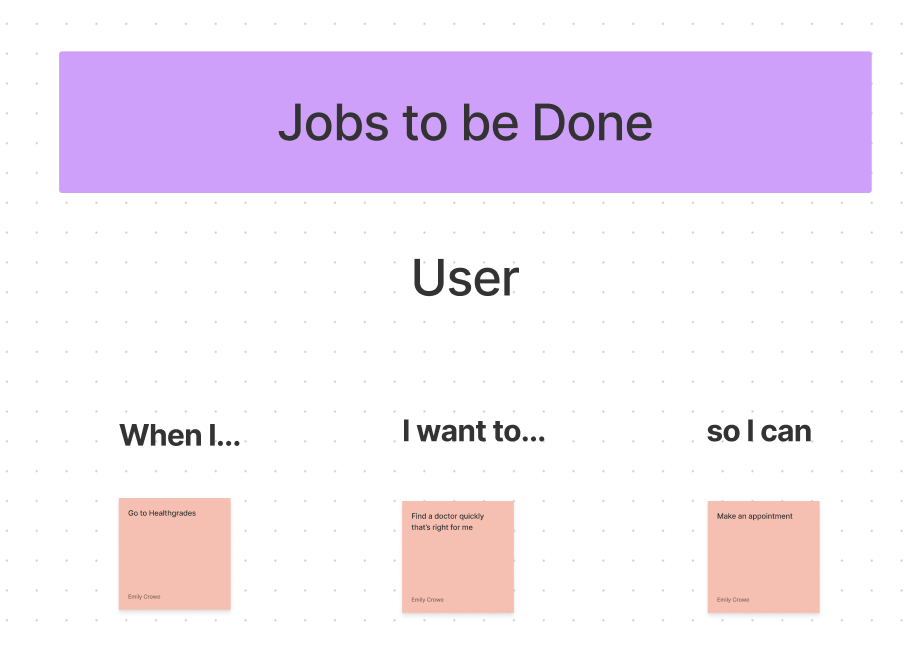
Finally, I put together a Jobs to Be Done (JTBD) framework in FigJam to help focus the problem solution on things that are most valuable to the Healthgrades user.
“When I visit Healthgrades, I want to quickly understand the information on a provider profile so that I can make my healthcare decisions with confidence.”
Throughout this process, I kept in mind the following: How might we simplify the current design to help users find the right provider as easily as possible?
User Research
Next, I wanted to ask myself: how can I understand this problem better?
This meant a few things: (1) watching users interact with the designs as they stand today with few prompts, and (2) completing a SUS Plus test.
This led me to understand that the users felt overwhelmed by the amount of information on the page and wanted a simplified experience (which aligned with my original hypothesis).
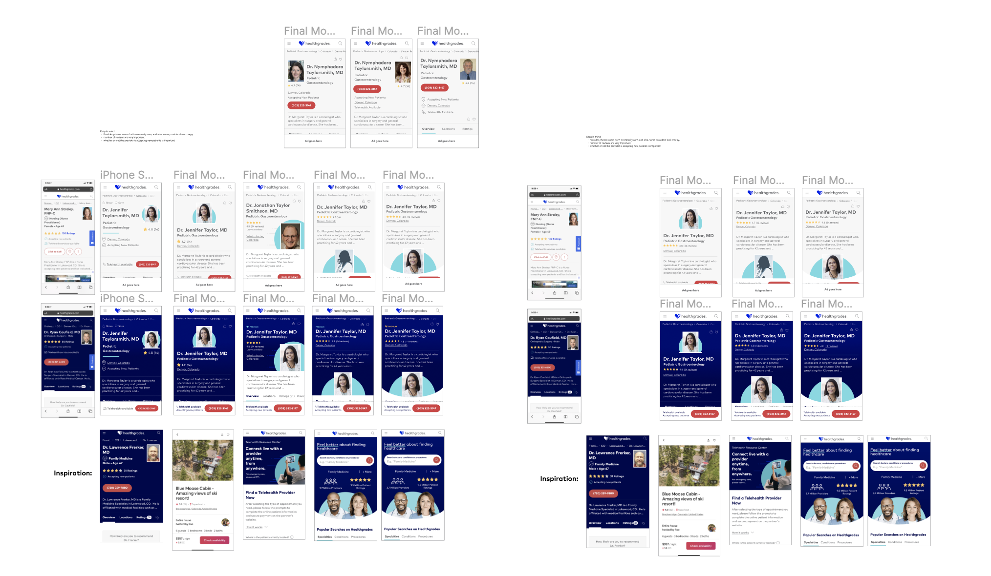
Then I completed a competitive analysis.
Some key questions I was looking to answer: Who else does this well? Who else is in this space? What other brands can we learn from here?
Here’s my annotated notes and screenshots from this process:
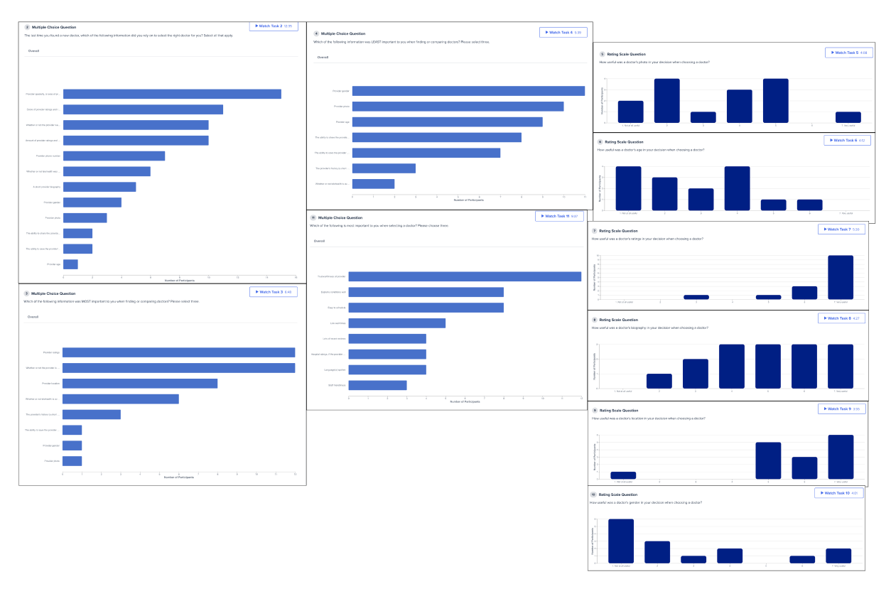
I also did some exploratory user research, including online interviews and surveys with 14 users who have visited a doctor recently.
My intention here was to interview for empathy and really understand user wants and needs, and my goal with this research was to understand the most important things to users when they look at a provider’s online profile.
Here’s a look into some of my findings:
Research Results and Insights included the following:
🔑“Must Haves” include name, specialty, ratings, whether or not the doctor is accepting new patients, phone number, and location.
☀️“Nice to haves” would be a telehealth callout, photo, and how to share and save that provider.
👎“Don’t Really Need” include a short bio, the gender, and the age.
At this point in the project, I touched base with my UX manager and engineering manager on what I’d found so far and my recommendation on how to move forward.
Mocks in Figma
My team typically works iteratively with mid or high fidelity mocks in Figma. These particular mocks were specifically designed based off of user research findings and our competitive analysis.
For this project, I put together over 50 initial designs. I completed dot voting with my team on various features of the initial mocks and synced with my devs to make sure they had no major concerns.
For reference, here is the brand’s homepage. I was attempting to align the mobile designs with this type of look and feel.
User Testing of Designs
Next, I tested the designs with a prototype to test via evaluative user testing. I was sure to use our personas in usability testing in the initial scenario/set up.
Here are a few key insights that I got from users:
Pages with a mixed horizontal and vertical reading view were confusing.
The rectangular image in the circle doesn’t work - it looks forced.
Users want a design that is “clean, crisp, and well organized.”
Using the word “premium” is confusing, and users thought that it meant they’d have to pay for some sort of service
And of course, I wrote out the research findings in Confluence for easy sharability and findability across the organization. When I share out findings, I’ve found that focusing on storytelling is key.
(P.S. For how I standardized and updated Healthgrades’ research process, check out this case study!)
Design Iterations
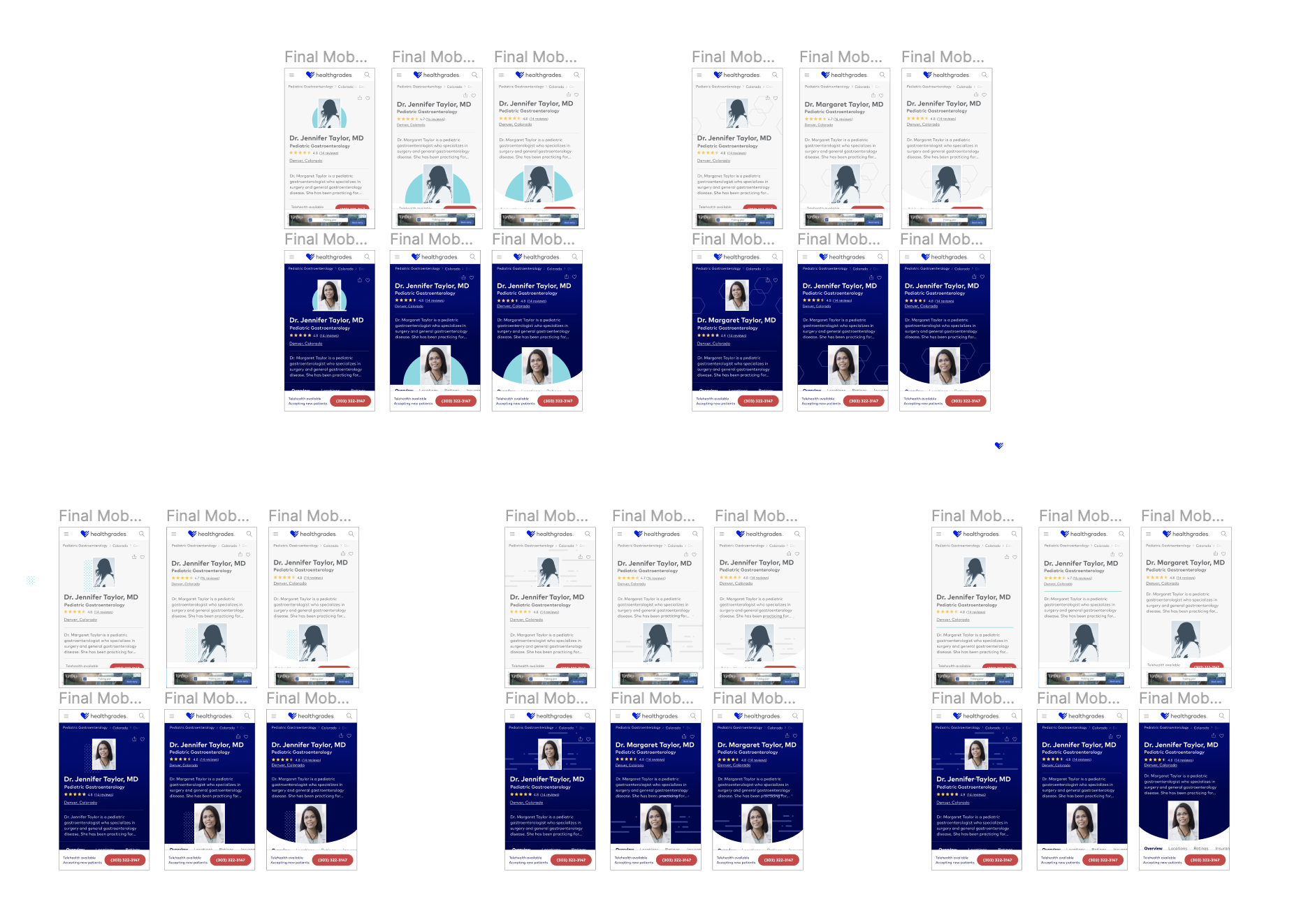
After doing the initial design testing using UserTesting.com, I made updates to the mocks based on my findings.
Here are a few examples of these mocks:
Next, it was time for another round of user research and some structured usability testing.
Here’s some visuals of the annotated research findings:
Design Evangelization
It was finally time to share the designs with directors and VPs. I shared four design options with them to make sure that they had no major concerns.
A quick note here: although “opinions” aren’t always what I strive to solicit in my designs, these four options had tested very well with users, and at this time in the project, it was appropriate and necessary for me to get stakeholder buy-in.
Edge Cases
After standardizing the design with users and stakeholders, I worked with my front end devs to design edge cases for all of the types of doctor profiles on the site. Here’s a quick list of some of the edge cases that I designed for:
As a part of the edge case solutioning, I worked extensively with my front end engineer. I even came up with some solutions that actually reduced the number of edge cases!
Final Designs
Finally, the designs were complete, and I handed them off to the dev team.
✅ Stakeholder signoff
✅ Dev o-k
✅ Brand (marketing) team alignment; SEO team alignment
✅ Clean Figma file
✅ Works for the key needs of our two personas
In Retrospective…
Initial results: the designs are in dev currently (on testAWS). The cross-functional platform experience was improved as a result of this, branching off into a new project. Edge cases were also reduced via strategic designs.
What did I learn? Address design debt before it gets too big! Allocate ~25% of time within a sprint to work towards design debt. Also, create “rules” for what belongs above the fold.
What tradeoffs did I make? CTA button placement and rectangular photo placement.
What didn’t go to plan? Stakeholders wanting to add things in after the design was complete (spoiler alert: I kindly said no). Not having a PM throughout the process.
If I could do it again, what would I change? Although this was a big project, I would have prioritized it sooner over smaller feature work due to the substantial positive UX impact.
Additional Case Studies


