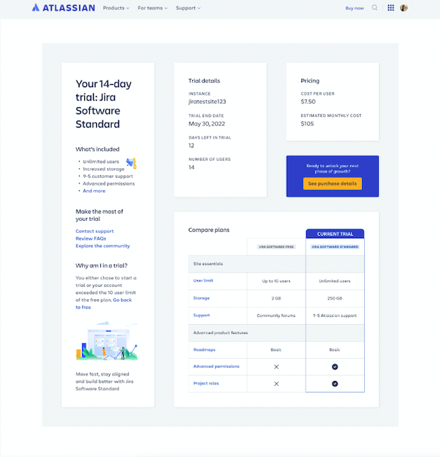
Atlassian Jira Standard Trial Overview Page
TL;DR: While at Atlassian I worked on a team in the Growth area of the business. Our goal was to work fast, ship quickly, and improve the metric of Jira Software purchase rate. As a senior UX designer, I was responsible for delivering experiences which both met business needs and also ensured design quality and alignment with our users.
This project was 100% remote, worked within a tight scrum team from ideation to delivery, and resulted in a 25% increase in purchase rate.
Background
I worked on a fast moving team focused on the monetization of Jira Software Free to Standard customers. My Scrum team experiments constantly and ships quickly, and my role is ideate new projects and ensure that the experiments we ship benefit the user, maintain a high quality of design thought leadership and execution, and move the needle on business metrics.
The Project
We needed a new, big experiment to make a serious dent in our purchase rate metrics. What would the project be? What would we focus on? We started out with a single business goal and ended with an entirely new webpage experience that was shipped in four months (conception to delivery).
Ways of Working
My Role
Senior UX Designer - Ideation and Workshop lead - Low, Mid, and High Fidelity UI - Research - Design Review with Stakeholders - Developer Sync
The Team
Senior UX Designer - Product Owner - 4 Developers - Scrum Master - QA Analyst - BI analyst - Marketing Stakeholders
Tools Used
Figma - Figjam - Mural - UserInterviews.com - Dovetail - Zoom - Slack - Pen and Paper
The beginning - ideation
Business problem: HMW increase purchase rate? We need a new experiment to report back to our stakeholders with real business results.
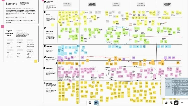
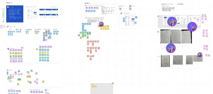
I spent an afternoon with my scrum team leading a remote ideation session in Mural to come up with a design thinking solution to our problem.
We worked together to sort through existing user research and insights, look at journey maps and our persona, and determine what our customer problem and solution was. Each person had a say and we brainstormed the problem and solution statement together as a team during the workshop.
Personas, journey maps, and known insights
I started with what we knew: the customer, their current and future state journey maps that I had done a few months previously, and the research that we had on hand.
Problem statement: I am an admin that just landed in a JSW standard trial and I am trying to understand and experience how JSW can benefit my team. But, I am unaware of my upgrade details because information around customer limits and upgrades aren’t readily available or apparent as I’m trying out the software, which makes me feel confused.
Ideal state: In a perfect world, I would have an omnipresent edition central that would share status, user count, Jira state, etc. and clearly and obviously display the differences between the JSW versions. The biggest benefit to me is that I can trust Atlassian to give me the resources to be able to do what my team needs to do, which makes me feel happy, confident, and informed.
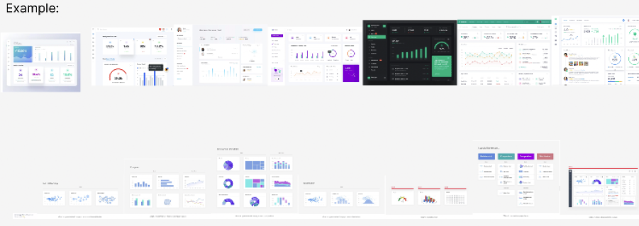
Once we had our problem statement, it was time to do some design ideation. I started with a competitive analysis for inspiration, and then moved to my own pen and paper explorations.
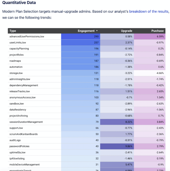
I also pulled in insights from previous projects from my analyst to determine what type of content and data to include in the new experience.
Design Beginnings
I next started creating mocks ups in Figma to explore possibilities. I completed over 120 mid-fidelity design iterations before narrowing down a few to review and “spar” with my design team, developers, and marketing stakeholders.
Design System Decisions
Atlassian has two design systems that are used in two different places: on the homepage - “Web Pattern Library” vs. in product - “Atlassian Design System”. Should I use WPL or ADS for this project?
I consulted with my developers to determine where the code would live and also thought about the best user experience based on the anticipated user flow:
In the end, I went with the design system WPL based on expected user behavior and developer recommendations.
User testing and sparring
After initial mock up decisions, I came up with a few options to review with my stakeholders
I then narrowed down options and did moderated user testing on UserInterviews.com to get user’s initial reactions and comprehension of the experience
Finally, I reviewed everything with my design team of 8 experienced designers to get a high altitude of feedback on the experience
Project Snafu
pressed for faster delivery and design changes from product owner
Was worried that the project wasn’t moving fast enough, so came up with a new design direction and scope
Design quality was at stake, along with all feedback previously captured
How could I work collaboratively with this much product design direction and time pressure? I quickly came up with three options of how to move forward, plus solution and recommendation based on business impact, customer impact, and developer scope.
Final Design
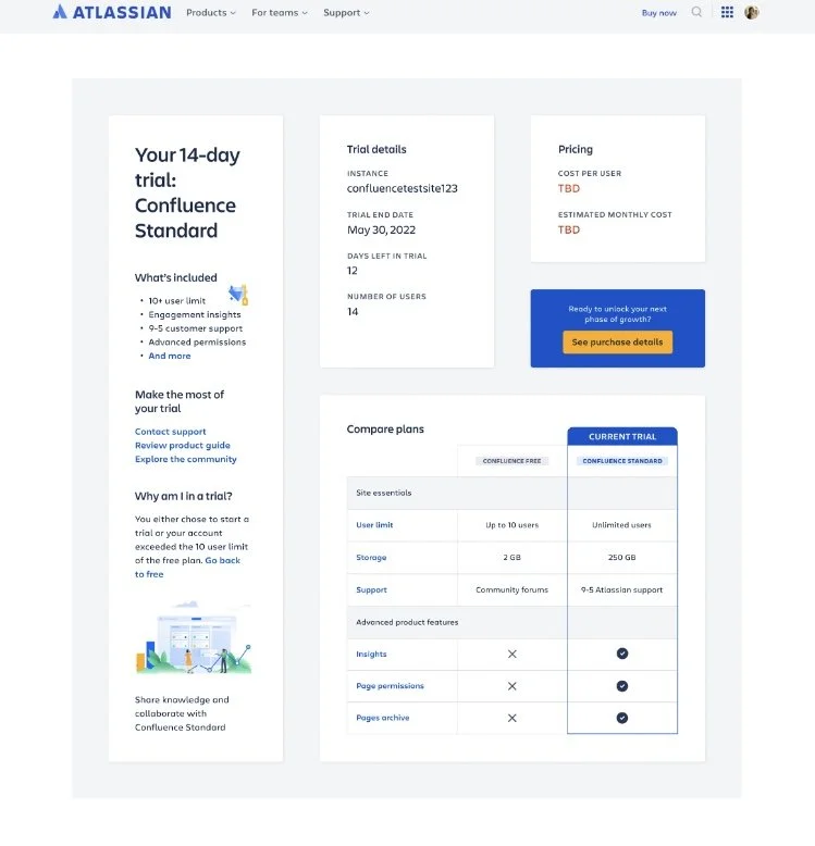
We ended up moving forward with the initial design direction that I recommended and cutting out a few features that would be implemented after the MVP launch. Here’s what the initial design looked like.
User testing after MVP delivery
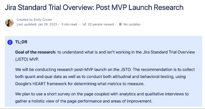
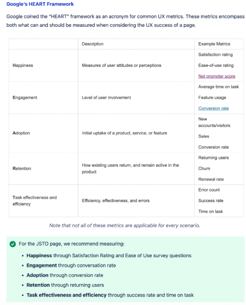
Did a combination of quant and qual testing using intercom, Google’s H.E.A.R.T. framework, two quantitative SUS questions, and user interview follow ups
Key insights from the research included: wanting to understand reason for upgrade immediately, uncertainty around CTA
Learnings from User Testing and Future Experiments to Build
After user testing, have 5 new experiment ideas to run on the page, including CTA testing, adding additional marketing content, adding new features.
Project Results
25% uplift in purchase rate - project was launched in late November 2022
The success of this project led to a similar project, a Jira Software Free overview page, where I led a team of four designers on the next iteration of the project:
The page was also duplicated and built for Atlassian’s additional products, Confluence and Jira Service Management.
In Retrospective
It’s an art and a science to balance ship speed with design quality and user value. I had to learn what to compromise on (additional features) and what to stand firm on (design and premise of the page)
“You are not the user”: customer feedback is critical, and falling back on those insights as decision-making collateral is a sure way to make a strong impact.
Stay plugged into the business so that you can anticipate changes that may arise. A designer should never just be in “design land,” they also must be influencing stakeholder conversations and keeping an ear to the ground on the state of the business.
Additional Case Studies


